Redesigning Pakistan's national skills platform.
The National Vocational & Technical Training Commission (NAVTTC) is the federal body behind Pakistan's technical and vocational training. Its website has to serve students, institutes, employers, trainers and certificate verifiers at the same time. We rebuilt the homepage around what each of them came to do, designed the campaign creative that carries the flagship programmes, and handed over a reference build the implementation could be checked against.
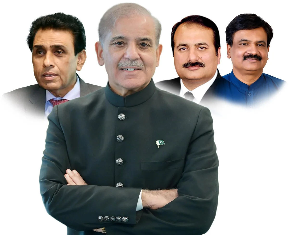
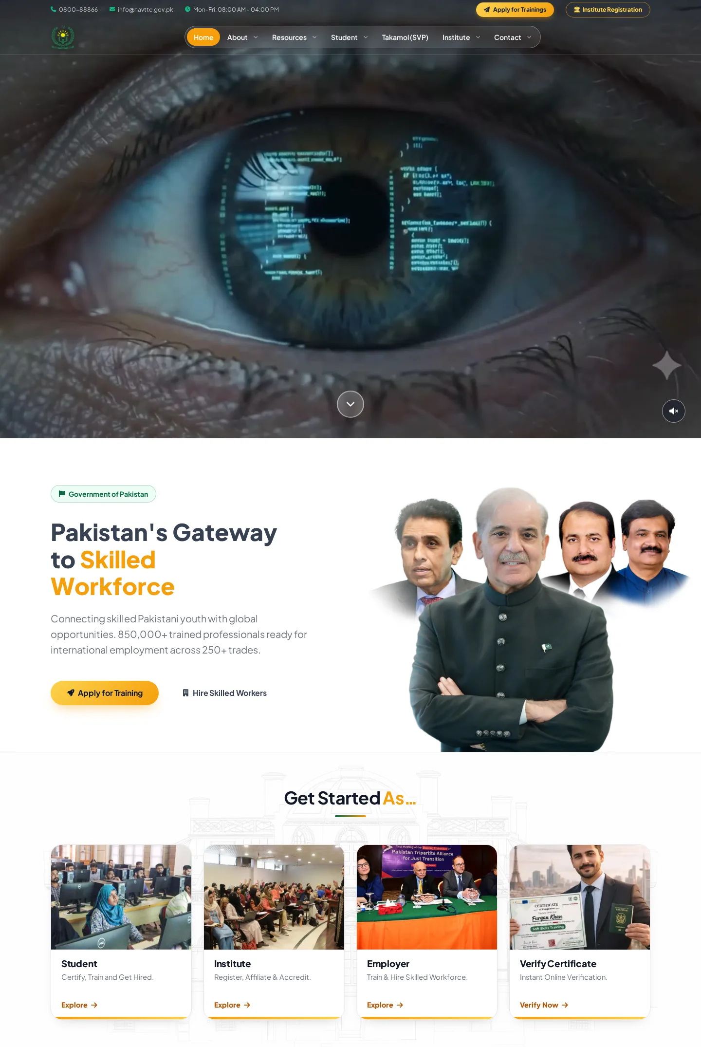
Six audiences. One homepage.
NAVTTC is not an informational site with a news feed. It is a service organisation with distinct products for distinct people: a student wants to enrol, an institute wants accreditation, an employer wants verified workers, a trainer wants curricula, and a citizen wants to check whether a certificate is real. The job was not to make a government site prettier. It was to make it legible.
Traffic figures are third-party estimates (Semrush, July 2026; Similarweb put the domain nearer 1.6M monthly visits in December 2025), not NAVTTC’s analytics.
An outward-facing site organised inward.
NAVTTC came to us with a live site and an internal consensus that it was not working. Our audit made the problem specific. Most homepage elements served NAVTTC internally: departments, notices, circulars. The people the site exists for had to guess.
Everything was important, so nothing was
A dense homepage of competing blocks at equal visual weight. No hierarchy, no first thing to look at.
Navigation mirrored the org chart
Menus followed internal departments. A student looking for a course had to already know which department ran it.
Flagship programmes were invisible
Nationally significant initiatives (PMYSDP, RPL, Takamol) were presented as ordinary links.
Portal sprawl
NAVTTC runs many separate online systems. They were scattered, inconsistently labelled and easy to miss.
Distraction from the primary task
Announcements and rotating imagery pulled attention away from the actions people came to take: apply, register, verify, hire.
Desktop-first, mobile-second
A large share of the audience is mobile-only: students, trainees, overseas job-seekers. The old layout degraded on small screens.
The brief in one sentence: not a template. The client's own references were Saudi Vision 2030 for how a national programme tells its story, and Coursera and Udemy for how learning is merchandised: image-led cards, tags, clear actions. It had to feel like a national programme people would be proud to be part of, while remaining unmistakably an official government body.
The tension we had to resolve: a government site wants restraint and authority; a modern skills platform wants energy and visual richness. The redesign had to hold both.Six people, six questions.
We wrote a short persona for each audience, focused less on demographics and more on the single question they arrive with, because that question is what the homepage has to answer. Each path below is the route on the live site.
Six audiences, four cards. On purpose.
We did not give every persona a card; that recreates the clutter we were removing. Cards went to the four transactional intents: learn, register, hire, verify. The informational audiences are served by navigation and content, so the entry row never has to compete with itself.
The section order is the argument.
Organise by intent, not by department. Every section of the new homepage answers one question, in the order a first-time visitor would ask them: what is this, what can I do here, what is running, how do institutions join, which system do I need.
- 01Topbar + sticky navigationContact, hours, and two persistent actions: Apply for Trainings, Institute RegistrationEveryone
- 02Film heroWhat NAVTTC is, before a word is readFirst-time visitors
- 03GatewayMission in one sentence, then exactly two actions: Apply for Training, Hire Skilled WorkersStudents, employers
- 04Get Started As…Four doors: Student, Institute, Employer, Verify CertificateAnyone with a task
- 05Message to the youthThe institutional voice, in its own framePublic
- 06Partner with NAVTTCThe institute pathway as a numbered sequence: Registration, Affiliation, AccreditationInstitutes
- 07Flagship InitiativesCampaign slider: PMYSDP, RPL, TakamolStudents, job-seekers
- 08Skills InitiativesProgrammes as image-led cards, not text linksStudents, trainers
- 09NVQF + AccreditationThe qualifications framework explained; a three-step accreditation processInstitutes, trainers
- 10NAVTTC Digital ServicesEvery online system, named in full, with a one-line purpose: NSIS, NVQF Registry, LMIS, TISRepeat visitors
- 11FooterQuick links, portals repeated for the returning visitor, contactEveryone
One rule applied throughout: each section gets one primary action, at most two. The old site's clutter came partly from every block trying to convert. Here the hero informs, the gateway converts, the cards route, the programme cards deep-link, and the portals launch. Nothing competes.
Section by section.
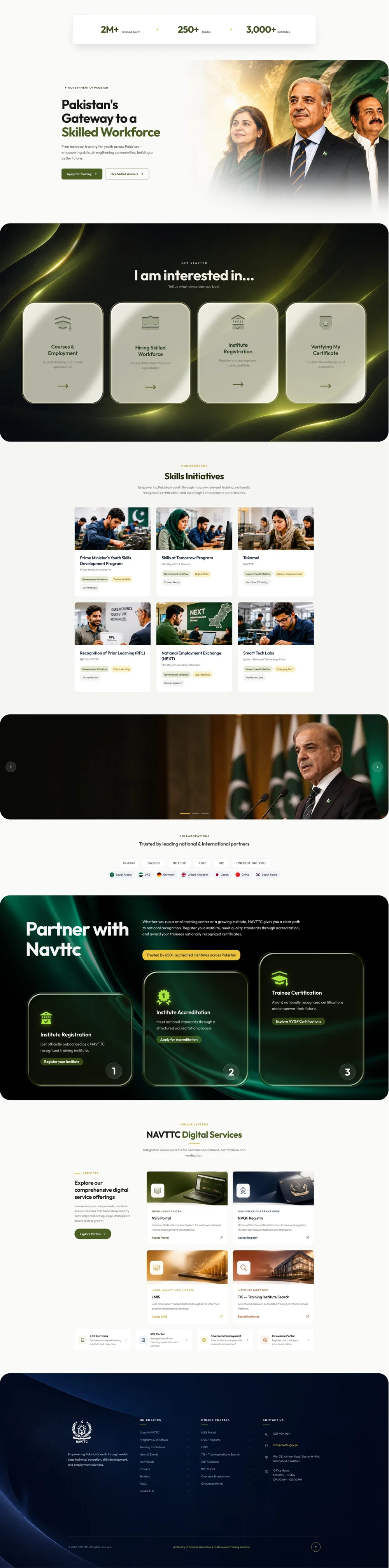
The design frames below are from our reference build of the homepage. Where the shipped site differs, the caption says so.
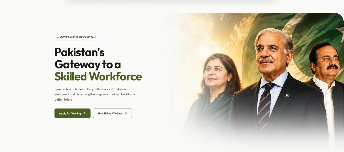
The mission, then two choices.
"Pakistan's Gateway to a Skilled Workforce" in one sentence, with the accent on the phrase that matters, followed by the two most important actions on the entire site: Apply for Training and Hire Skilled Workers. Supply and demand.
Everything above this point informs. This is the first place the page asks the visitor to act, and it offers exactly two choices.
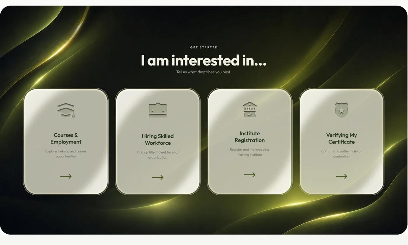
A question the visitor can answer about themselves in under a second.
Four cards, one per transactional intent. This is the single most important section for the information-architecture goal: it turns the department-based navigation problem into "which of these is me?"
The dark treatment is deliberate. It breaks the light rhythm of the page and signals "this is where you choose", while the cards themselves stay extremely simple.
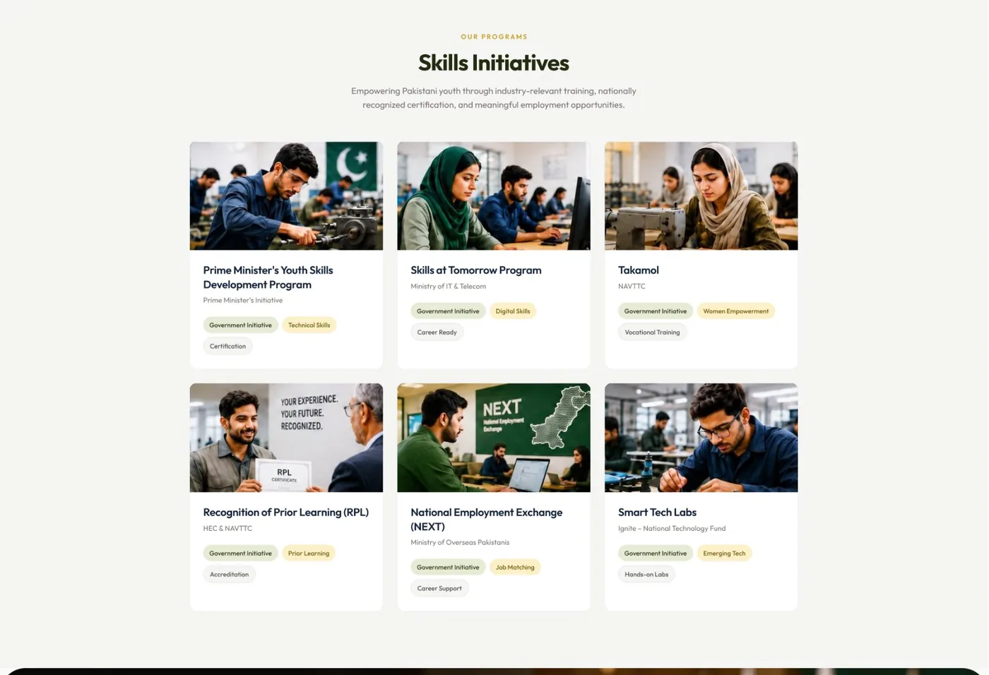
Programmes as products, not links.
Image-led cards with a category tag, title, short description and a clear action. The layout borrows the merchandising logic students already know from learning platforms, because that is how they evaluate options. The old site listed these programmes as text; here they are the visual centre of the page.
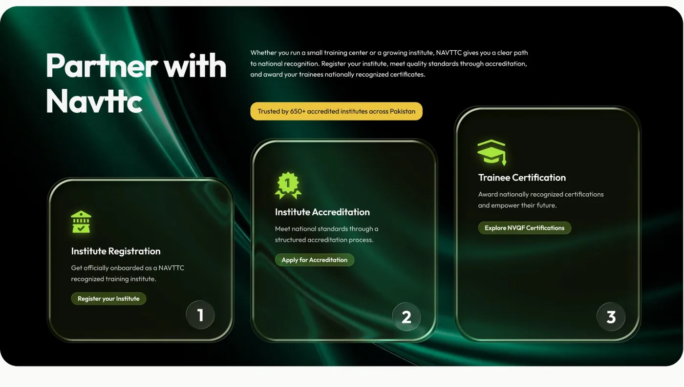
The numbers are the design.
Institutes previously had to work out that registration, affiliation and accreditation happen in sequence. Numbering the steps large makes the sequence unmissable, and the line above the cards ("Trusted by 650+ accredited institutes") reframes the process as joining an established network rather than applying to a bureaucracy.
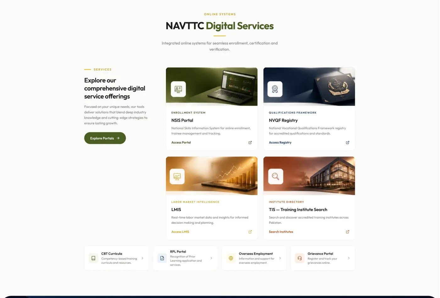
Every system, named in full, in one place.
NSIS Portal, NVQF Registry, LMIS, TIS: each with an icon, the full system name, a one-line purpose and an outbound link. This section solved the portal-sprawl problem. Trainers, institutes and verifiers, the repeat visitors, get a stable launchpad. The portals appear again in the footer for the visitor who scrolls straight to the bottom.
A rule we applied everywhere: never show an acronym without its full name and what it is for.
A high-production site needs high-production assets.
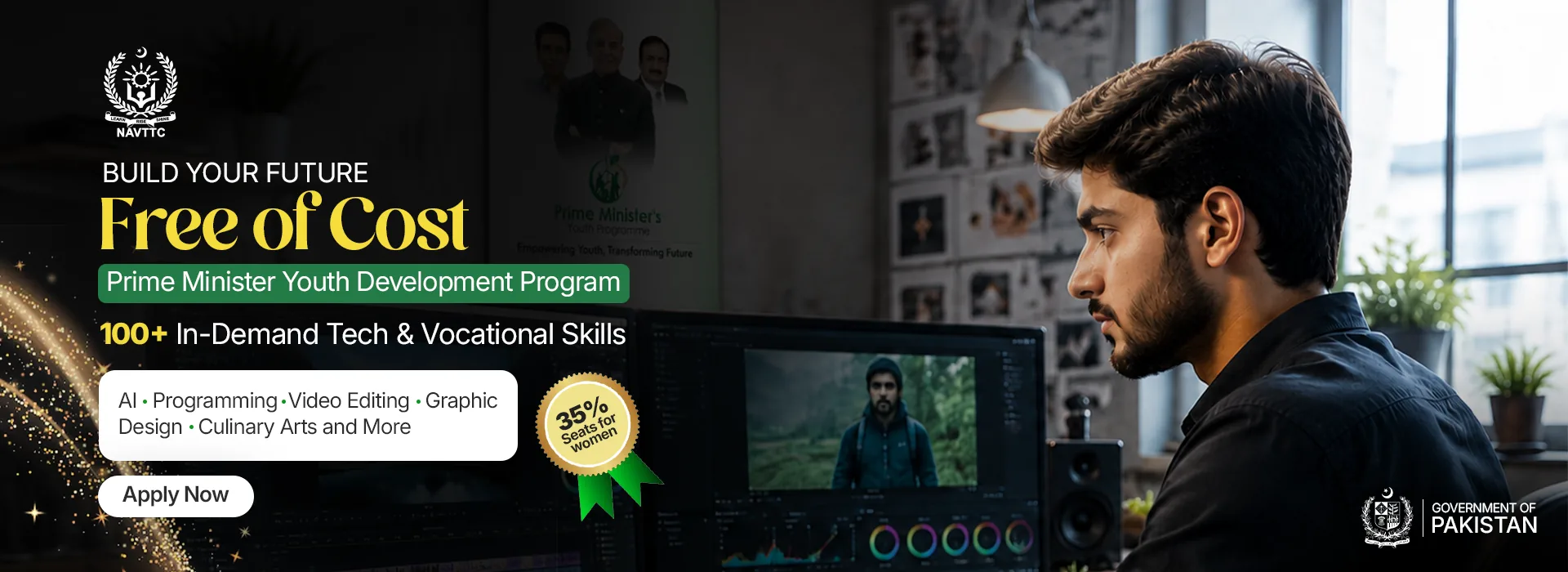
The client's rejection of a template look was as much about production value as layout. So the campaign banners that carry the flagship programmes were designed in-house in Photoshop rather than sourced from stock. Three of them run in the Flagship Initiatives slider on the live site.


Three colour families, each with a job.
Rather than one brand colour with tints, the system uses three families that carry meaning: a green derived from the national colour for primary actions and institutional identity, a deep navy for the dark structural sections, and a warm amber rationed for emphasis. The values below are as implemented on the live theme.
#0A6847Buttons, active states, section accents. Institutional, not sporting.#0F172AHeader, footer and the dark sections that give the page its authority.#F59E0BThe highlighted phrase, key calls to action. Rationed so it keeps its effect.#F3F4F6 · #F9FAFBLight section backgrounds tuned to keep depth against the dark ones.Typography
Plus Jakarta Sans for display, headings and UI, with a defined scale from 12px labels to 60px display. Noto Nastaliq Urdu for Urdu text, loaded as its own face so it gets the line-height it needs.
Spacing & radius
An 8-based spacing scale (4 to 96px) and a three-level grouping scale: inside a unit, between units, between sections. Radii step from 6px chips to 24px panels, so cards stop being a different shape every time.
Content rules
One primary action per section. Full names next to every acronym. Partner logos and statistics sourced from NAVTTC, not invented. Credibility content has to be correct, not plausible.
Token values read from the live theme stylesheet at navttc.gov.pk, September 2026.
Designed for the phone, not collapsed onto it.
A large share of NAVTTC's audience only ever sees the site on a phone. The two persistent actions stay pinned at the top, every entry card keeps its image and label, and the institute sequence keeps its numbers when it stacks. Captured from the live site on a 390px viewport.
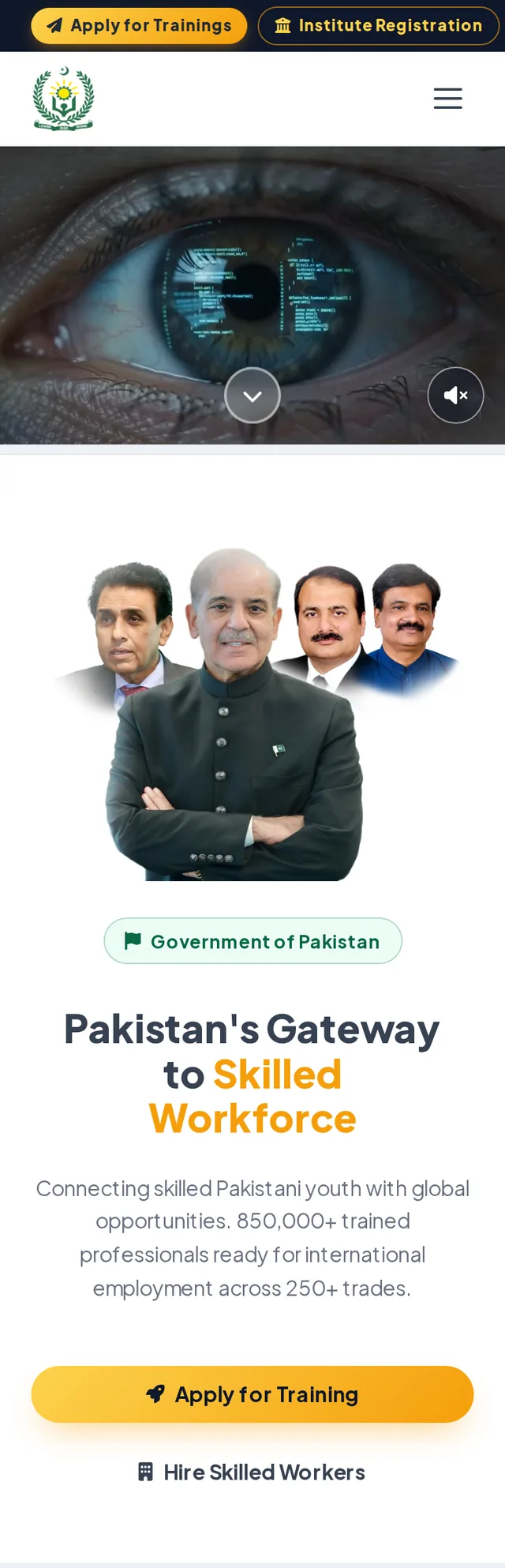
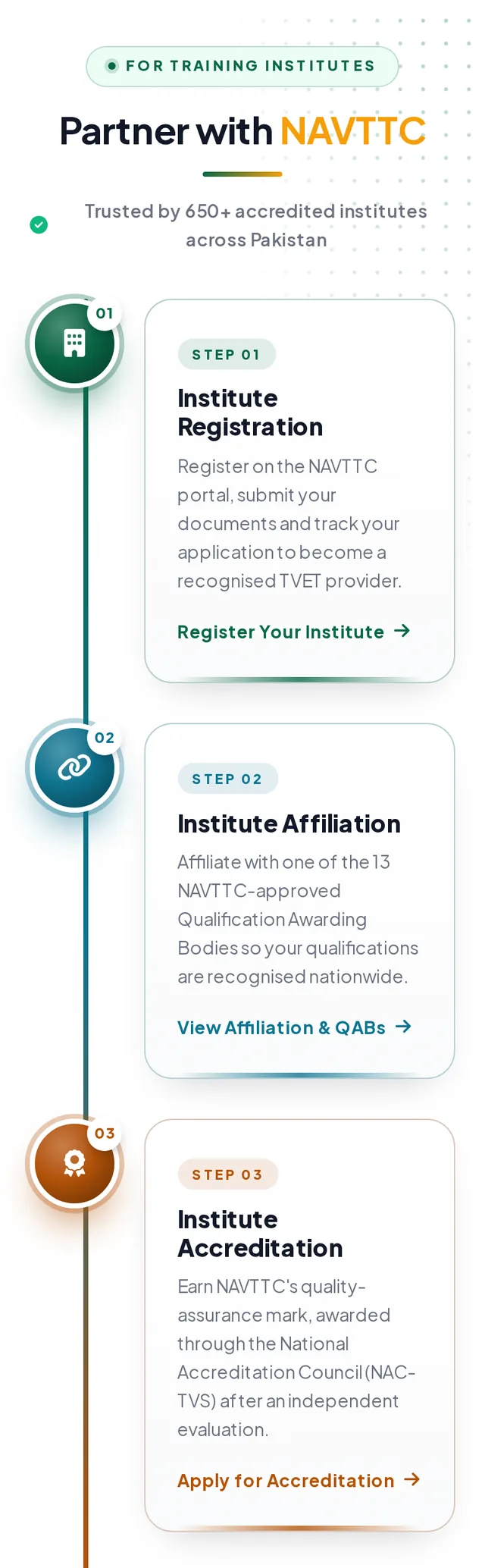
Hover or tap a screen to scroll through it.
Ship a reference, not just a mockup.
Static mockups invite interpretation. A working reference removes it. Alongside the design files we delivered a self-contained HTML build of the homepage, populated with real content, so the implementing team could inspect real layout, spacing and typography in a browser.
What we handed over
- Figma design files for every homepage section at desktop, tablet and mobile breakpoints.
- The HTML reference build of the homepage with real programme names, partner logos and portal descriptions instead of placeholder text.
- Campaign creative and asset library: banners, the RPL process graphic, partner logos at consistent sizes, icons.
- Behaviour notes for the sticky navigation, hero autoplay and loop, marquee speed and slider timing.
Implementation
NAVTTC's web team implemented the design as a custom WordPress theme. Where the shipped site diverged from the reference, the divergence was visible against a concrete standard rather than a matter of opinion: a "Get Started As" heading instead of "I am interested in", photography on the entry cards, an added NVQF section, a reordered institute pathway.
Designing with real content from the first hi-fi screen is what made this possible. Placeholder text hides exactly the problems that break government layouts: programme names of very different lengths, partner logos of wildly different ratios, Urdu text needing its own line-height. Real content exposed them early.
Open the live siteLive, at national scale.
The redesign shipped and is public on one of Pakistan’s most-visited education domains: roughly 390K monthly visits and a top-1,000 ranking in Pakistan by Semrush’s July 2026 estimate, nearer 1.6M by Similarweb’s. At that volume, every ambiguity removed from the homepage is removed hundreds of thousands of times a month. Every point below can be checked on the live site.
- Every core task is one decision from the top of the page. Apply, hire, register, verify, open a portal.
- Programmes are the visual centre of the homepage, not a list of links.
- Every online system is named in full, with its purpose, in one grid, and repeated in the footer.
- The institute pathway reads as a sequence, numbered, on desktop and mobile.
- The two most important actions never leave the screen on any viewport.
- A design system the client's team can extend: tokens, type scale, spacing and radii live in the shipped theme.
Traffic figures are third-party estimates, not NAVTTC’s analytics.

A government website is a service counter with many windows.
The design job is to label the windows. Three lessons we are carrying into the next public-sector engagement.
Organise by intent, not by org chart.
Content was never removed, only moved one click away behind a clear door. Stakeholders kept their content; visitors got clarity. That is how you de-clutter a site where every block is somebody's.
Design with real content from the first hi-fi screen.
Long programme names, mixed-script text and inconsistent logo ratios only show up when the content is real. Bringing it in early cost a day and saved weeks.
Hand over something a browser can open.
The reference build turned handoff from interpretation into comparison. Every deviation in the implementation was visible against it.