A chicken shop built as a place, not a price list.
Dippy's opened in Ward End with no brand, no customers and no reputation, into one of the most crowded fried-chicken markets in the country. We built the whole thing from zero: the identity, six illustrated flavour characters, a menu organised like a small town, and the room it all lives in.



Six flavours. Four formats. One system.
Dippy's does not sell chicken, it sells a choice: buttermilk-marinated, double-coated, fried to order, then dipped in one of six house sauces. Applied across burgers, tenders, wraps and loaded fries, that is not a list, it is a matrix. A matrix is a design problem before it is a menu.
Rating and platform listings checked 8 September 2026. Dippy's is a young business; we do not have access to its sales data and no figures here are estimated.
Everything had to exist on day one.
There was no version one to improve. The sign, the room, the menu and the box the food arrives in all had to be created at once and agree with each other from the first day of trading.
Birmingham has one of the densest fried-chicken markets in the UK, and the category has a house style: red, black and yellow, flames, distressed textures, and the word crispy doing all the work. When every sign on the road uses the same three colours, none of them is a signal.
Differentiation in a saturated category
Looking like a good chicken shop was not enough. So does everyone on that road.
A combinatorial menu
Six flavours across four formats, plus sides, sauces, drinks and four deal boxes. Flattened into a price list, it is a wall of near-identical lines.
One brand, wildly different surfaces
A three-metre painted wall, an A2 menu, a takeaway box, a phone screen, a 200-pixel app tile. A system that works at one size is not a system.
A room that had to earn photographs
New independents are discovered through customer photos. The interior had to give people a reason to point a camera at it.
Delivery-first discovery
For most first-time customers the brand is a small square in a scrolling list, next to competitors, with no control over the surrounding design.
Extensibility
The client would keep adding flavours, formats and offers without us. Anything built only for the launch menu breaks within months.
Stop competing on crunch.
Every brand in the category competes on the same axis: crunchier, hotter, bigger, in the same visual vocabulary. You cannot out-crunch a national chain in a customer's memory on day one.
Dippy's real difference was the sauce range, six distinct dips developed and tested over a long period and applied across every format. So we built the brand on flavour choice instead, and made choosing the thing the brand is about. That produced the line the business now runs on: Dipped to Order. It states the process and the promise in three words, and it was the only claim on that road nobody else was making.
No red and black
The most obvious way to look like a credible chicken brand was also the most obvious way to disappear.
No product photography as the identity
Photography ages, shifts with lighting, prints badly and is cropped by platforms you do not control.
No crispy, juicy, loaded
Those words are free for anyone to use, which is exactly why they are worthless as positioning.
Teal as the counter-move
In a street of red and yellow signage, a deep teal frontage is the only one not competing for the same wavelength. It also reads clean, which matters for a kitchen nobody has tried yet.
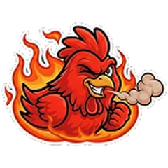
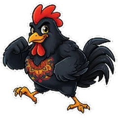
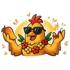
Six flavours, six characters.
Colour-coding six sauces is the obvious solution and it fails in three places: it does not survive black-and-white print, it does not survive a delivery platform that strips your styling, and it gives customers nothing to say out loud. Nobody recommends the orange one to a friend. They do recommend the dragon.
Each flavour got an illustrated character, a sensory line and an origin story, all drawn and written in-house. Six personalities are also six recurring social posts, six packaging variants and six wall subjects, without needing a new idea each time.

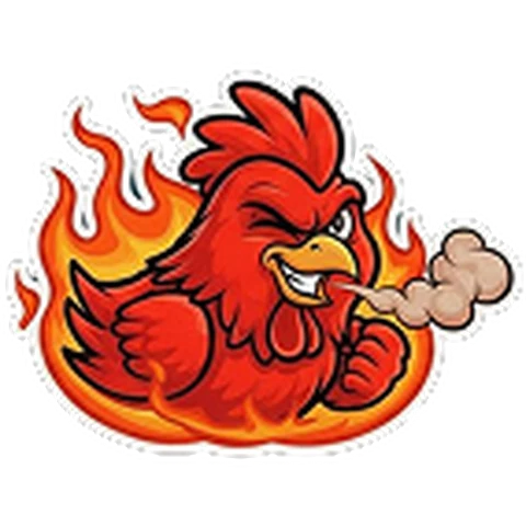
Buffalo Rage
A kitchen accident that became a legend: butter, heat and hot sauce colliding by mistake.
Nashville Riot
Born from heartbreak and revenge, a sauce built as a distraction.

Dragon Kick
Inspired by Asian fire-grilled BBQ, chased through chilli pastes and smoke.

Thai Wave
Straight from the Bangkok street market: sharp heat, fresh herbs, sweet-savoury balance.
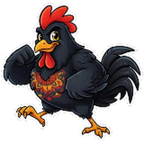
Peri Mode
Like lemon and chilli on a world tour. A friendly, zesty heat.
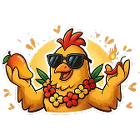
Mango Crush
Starts like a holiday, ends like a warm surprise.
Flavour copy as it appears on dippys.co.uk and the printed menu.
We named the menu like a small town.
A conventional menu is a filing system: Burgers, Chicken, Sides, Drinks. Efficient, and completely forgettable. We named the sections as if they were locations, so reading the menu feels like walking somewhere rather than scanning a spreadsheet.
It also does structural work. Someone looking for a cheap add-on knows to look in an Alley, not a Street, before they have read a single item.
The main road. Highest value, highest attention, one burger per flavour.
A cluster, not a strip. Smaller items, grouped.
A route through, not a destination. Sits between snack and meal.
The small turning off the main road where the extras live.
Open space. Where you stop and get the most for your money.
A single pool of one thing, priced identically.
Added after launch. Slots into the same grammar without a redraw.
Kept plain. Not everything needs a name.
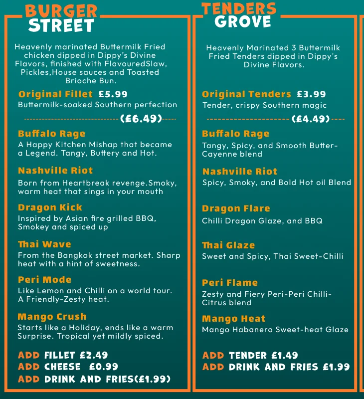
Learn the order once, use it everywhere.
The same six flavours appear in every food section, in the same order, every time: Buffalo, Nashville, Dragon, Thai, Peri, Mango. After the first pass, choosing a wrap uses exactly the same mental motion as choosing a burger.
It is the difference between a menu with forty items and a menu with six flavours and four formats. The second is something a person can hold in their head.
| Flavour family | Burger | Tenders and wraps | Loaded Road |
|---|---|---|---|
| Buffalo | Buffalo Rage | Buffalo Rage | Buffalo |
| Nashville | Nashville Riot | Nashville Riot | Nashville |
| Dragon | Dragon Kick | Dragon Flare | Dragon |
| Thai | Thai Wave | Thai Glaze | Thai Chilli |
| Peri | Peri Mode | Peri Flame | Peri Peri |
| Mango | Mango Crush | Mango Heat | Mango Habanero |
The first word is the memory hook and never moves. The second does the format work: Kick and Flare are both dragon, but one is a burger and one is a glaze. On Loaded Road the modifiers drop away entirely, because that section is a checklist of six options rather than a set of named products.
One field, two levels of frame.
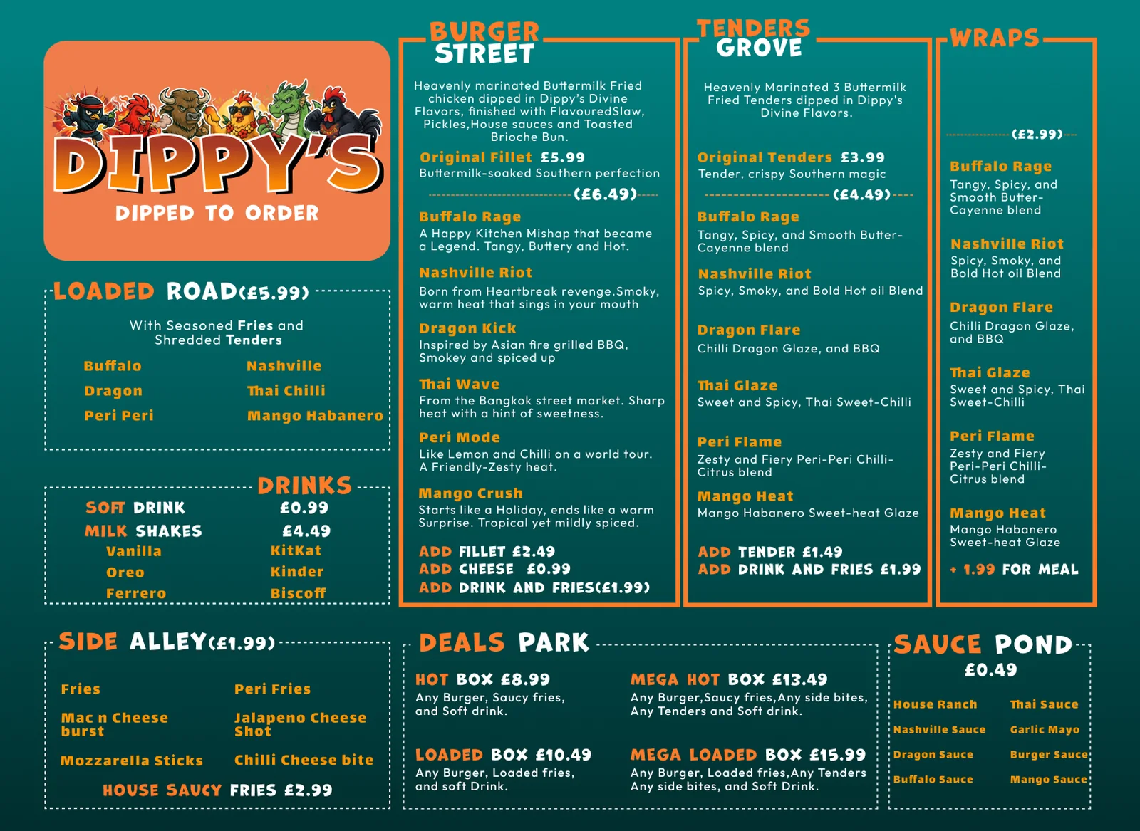
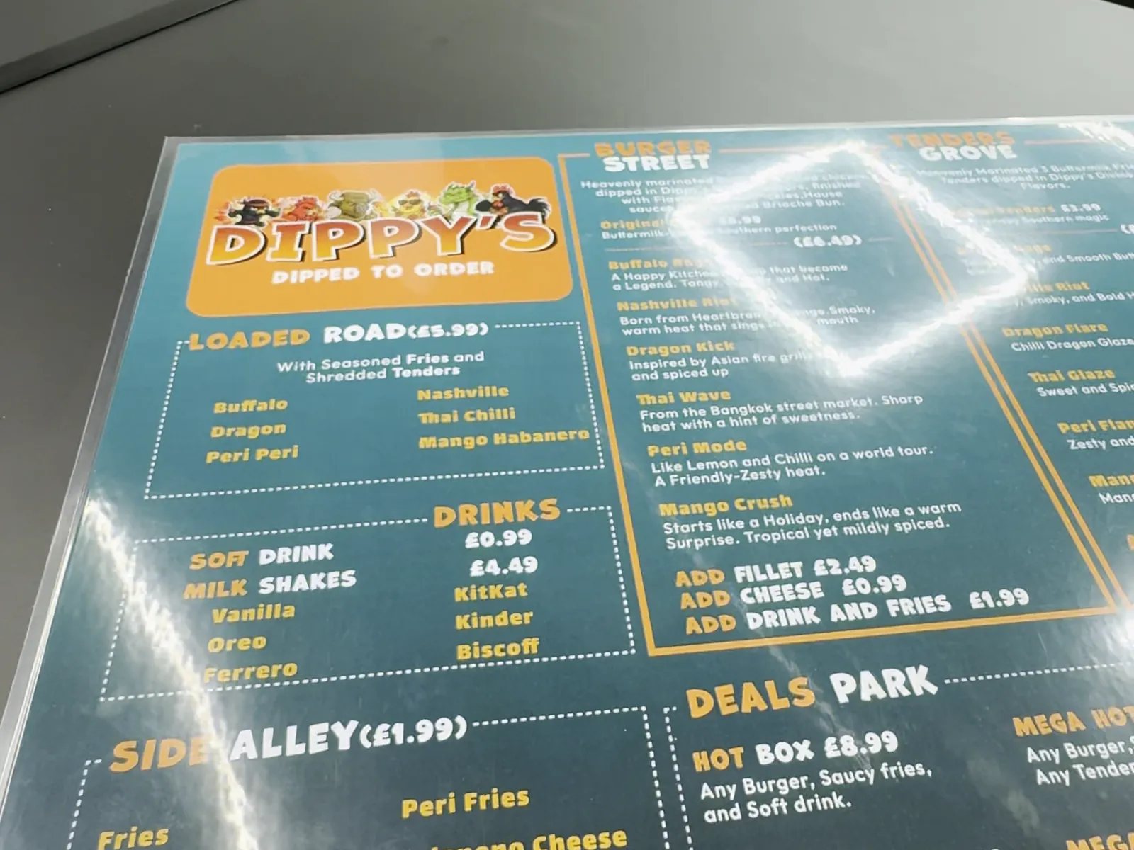
The menu is where the identity, the naming and the commercial requirements have to coexist on one surface. It works as a wall board, a printed sheet and an image shared on a phone.
Everything sits on a single teal field, darkest at the corners, with no contrasting panels. That is what stops a menu with eight sections from looking like eight posters stapled together.
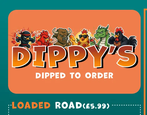
Characters standing on the sign.
The logo panel sits top-left, the natural entry point, as a soft-cornered orange block carrying the wordmark and tagline. The six characters are arranged along its top edge, overlapping it.
That overlap is deliberate. It makes them feel like they are standing on the sign rather than printed inside it, and it is the one place on the menu where illustration is allowed to break a container.
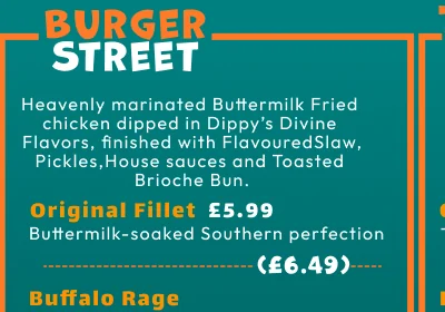
Eight headers, instantly distinguishable.
Every section header splits across two words and two colours, orange on the first, white on the second, with the second usually lower and larger. It gives each one a street-sign quality and creates a rhythm across a sheet that would otherwise be a grid of similar blocks.
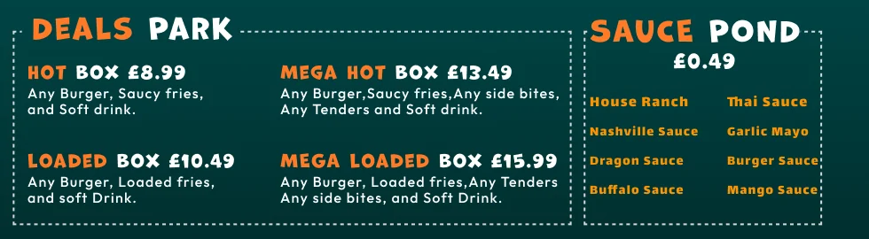
Thirty numbers removed from the page.
The menu prices at section level, not item level. Burger Street shows one price for the Original Fillet and a single flavoured price for all six; Wraps, Side Alley and Sauce Pond each carry one price in the header.
Only Deals Park prices item by item, because that is the section where price is the product. Removing roughly thirty repeated numbers is the single biggest reason the sheet reads as calm.
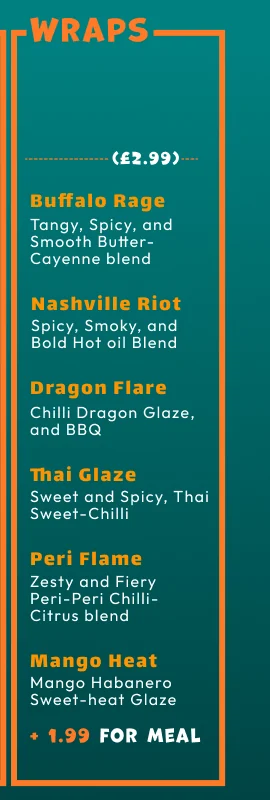
A structure, not a composition.
The menu was later extended with a Wraps section, added as a fourth solid-framed column alongside the hero categories, reusing the same six flavours in the same order at a single section price. The rest of the layout absorbed it.
A menu that has to be rebuilt to add a category is a picture. A menu that can absorb one is a structure.
Standing inside the thing the menu describes.
The menu establishes Dippy's as a place with streets, alleys, parks and ponds. The interior makes that literal. We designed the wall graphics and a signwriter painted them by hand, so the room carries brush texture rather than the flatness of applied vinyl.
The characters appear at full height along the seating wall with their flavour names and origin stories painted beside them, which turns the wall into the menu's story and gives every table a backdrop worth photographing. Teal runs from the shopfront through the booths to the counter, and the counter itself is wrapped in a repeating pattern of the flavour names.
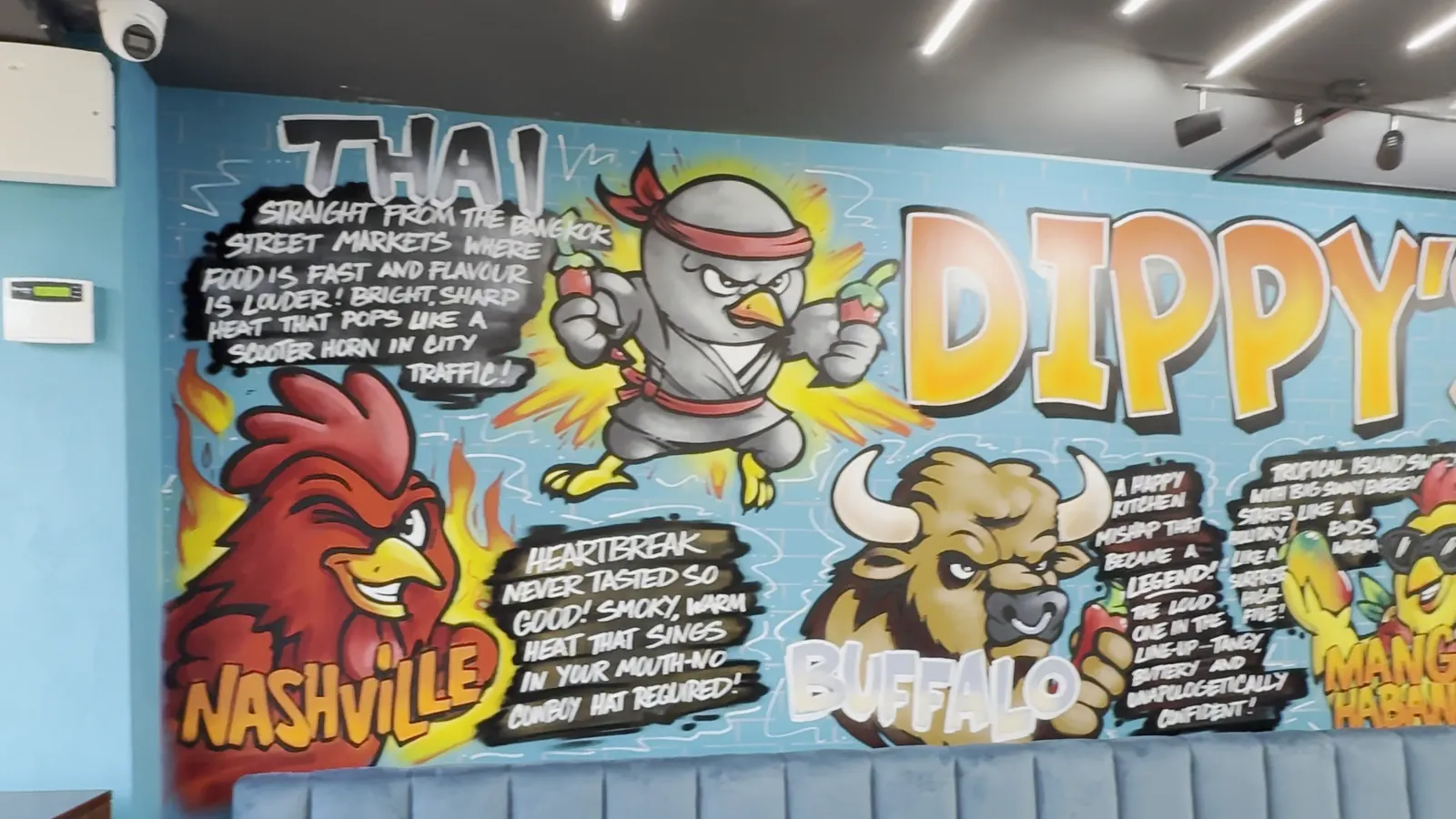
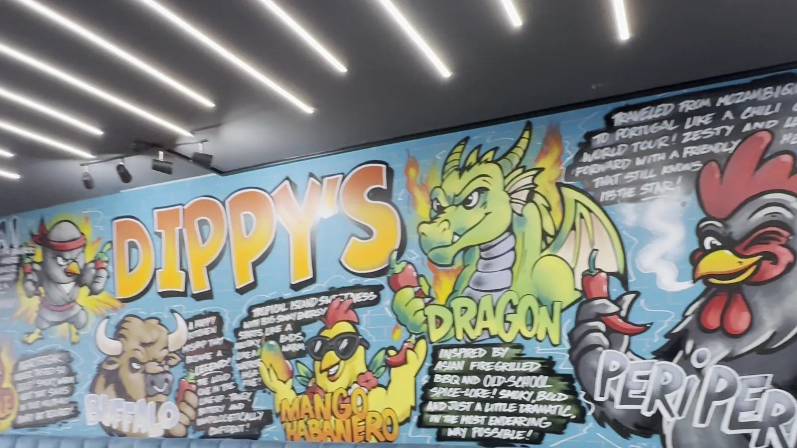
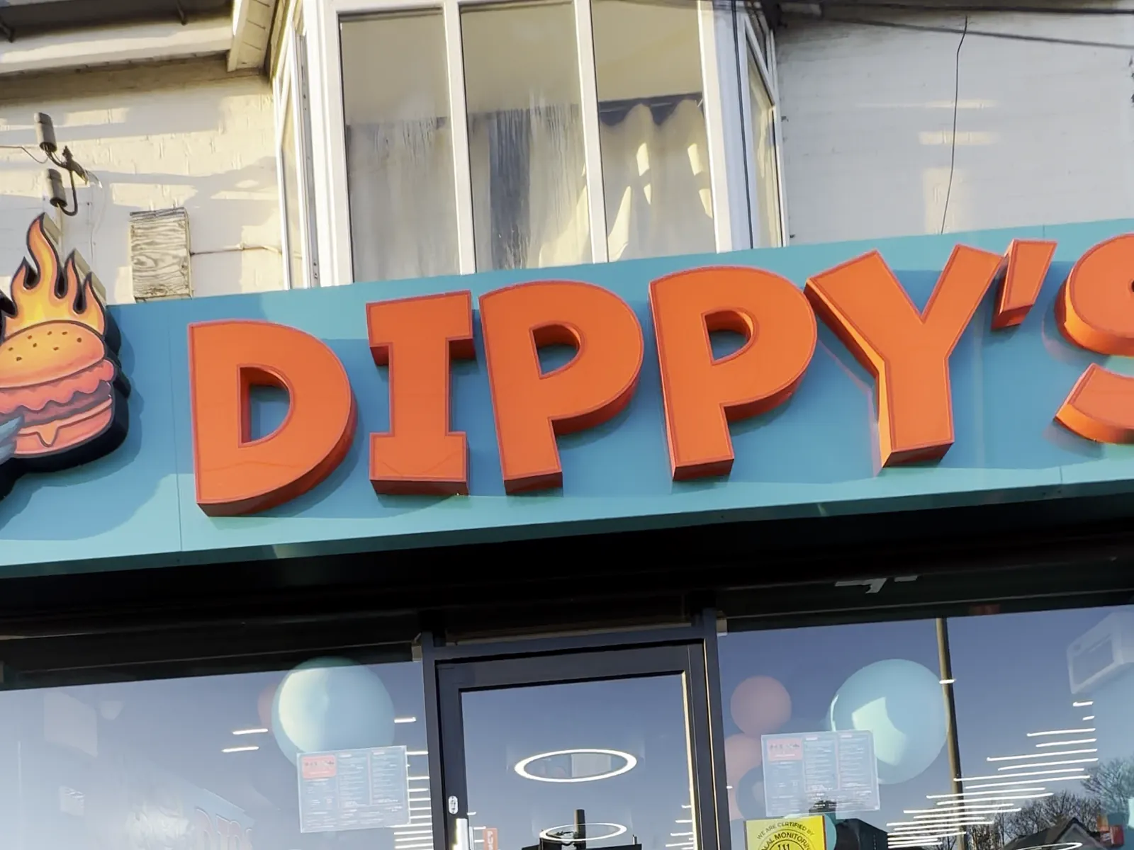
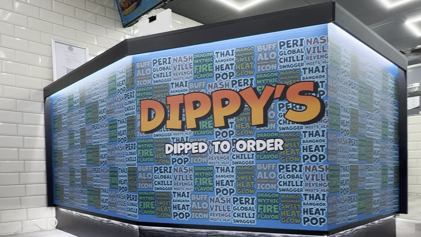
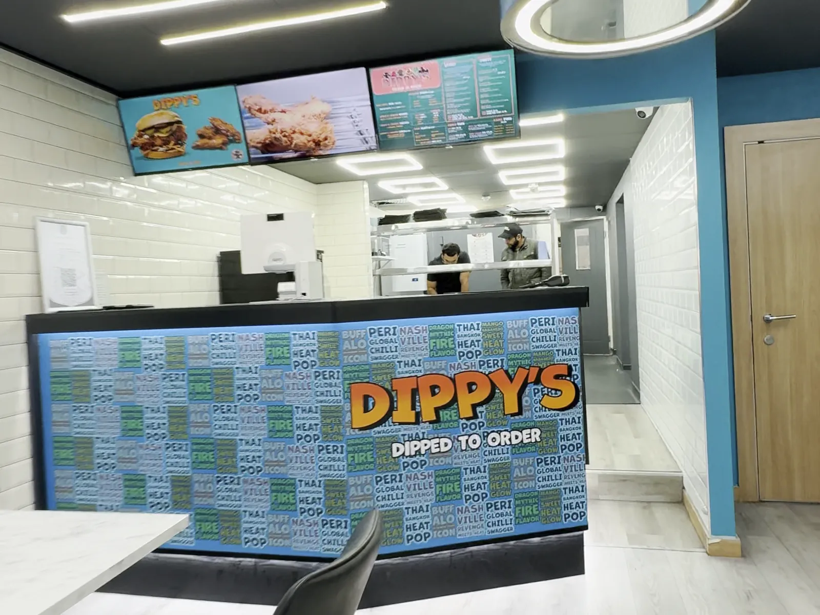
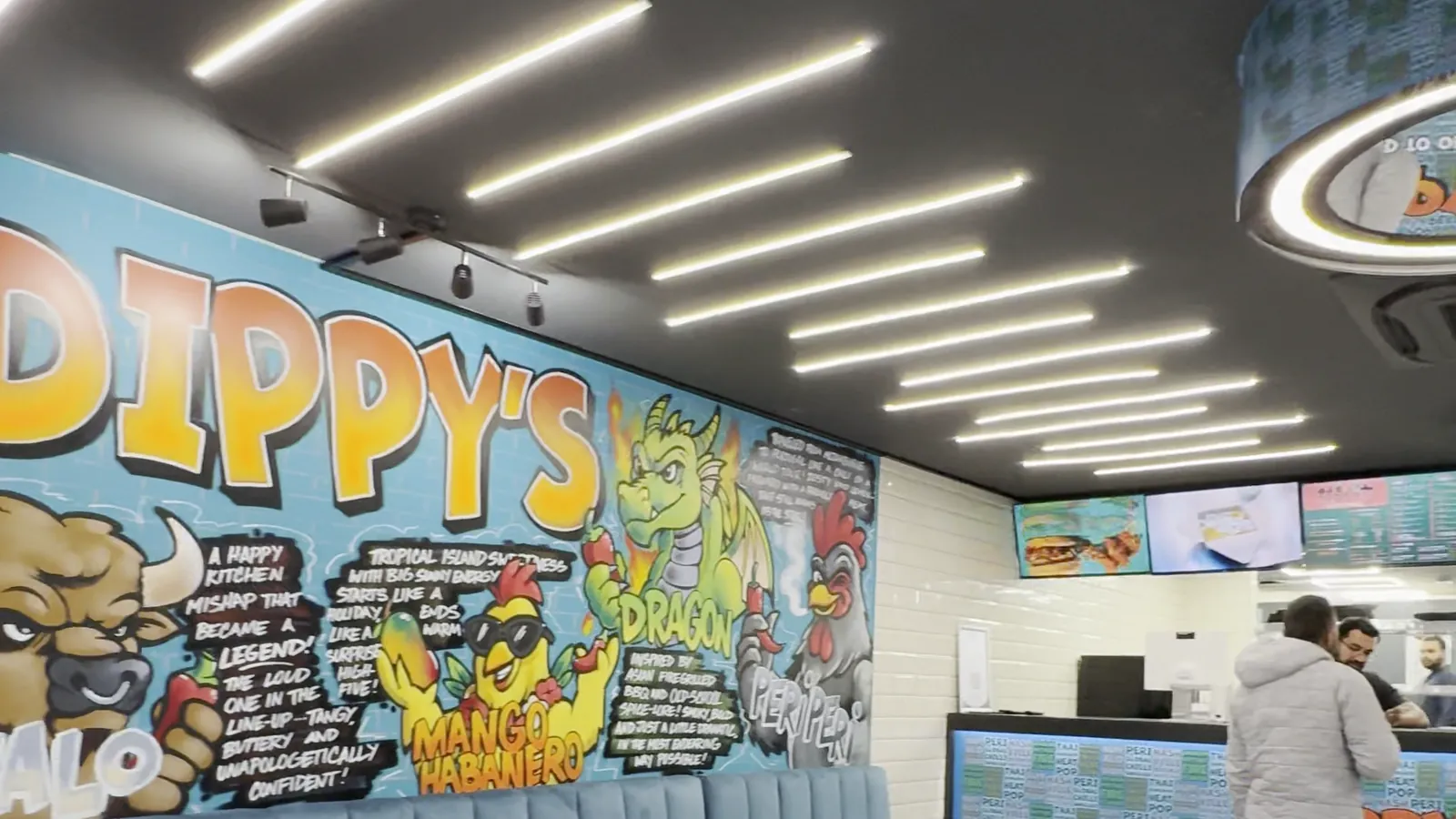
Photographed at the Coleshill Road unit shortly after opening.
The naming survived the handoff.
Dippy's is a young business and we do not have its sales data. What follows is what can be checked from public sources, dated. Nothing here is estimated.
- The section names reached the delivery platforms intact. Burger Street, Tenders Grove, Loaded Road, Side Alley, Deals Park and Sauce Pond appear on Uber Eats and Just Eat exactly as designed.
- The flavour names and their one-line stories travelled with them, verbatim across the website, Uber Eats, Just Eat and Foodhub.
- 4.4 out of 5 from more than 240 Uber Eats ratings.
- Live on three delivery platforms plus the restaurant's own ordering site.
- Customers review by flavour, not by dish. Published Google reviews name Dragon Kick, Buffalo Rage and Nashville rather than "the spicy one".
- Featured by the Halal Monitoring Committee on its own social channels.
Why the second point is the real outcome
Naming systems usually die at the first handoff. An operations team retypes the menu, or a platform forces its own categories, and within a week you are back to Burgers, Chicken, Sides.
Dippy's listings on platforms with their own templates and no interest in a client's design system still carry the structure. That is the difference between a design that was approved and a design that is in use.
The review language is a smaller signal in the same direction. Giving people specific words to recommend with is exactly what the characters were built for.
Visit dippys.co.ukAll listings and ratings checked 8 September 2026. Prices on delivery platforms differ from the in-store menu; platforms apply their own markup.
A menu is interface design.
It is the one piece of interface a restaurant customer is guaranteed to use, and most restaurants treat it as typesetting.
Put the brand in the words, not only the styling.
Uber Eats, Just Eat and Foodhub each strip away typography, colour and layout. What survived onto all three was the naming. Where there is third-party distribution, the copy is the part of the identity that travels.
Structure before decoration, even on a fun brand.
The teal, the characters and the bouncing wordmark get noticed first. The thing making the menu usable is a rigid repetition rule underneath. The playful layer works because the structural layer does not move.
Design the system to absorb the client's next idea.
Wraps arrived after launch and the layout took it without a redraw. That is what section-level pricing and a fixed flavour order buy you. Assume the client will add something you did not plan for.